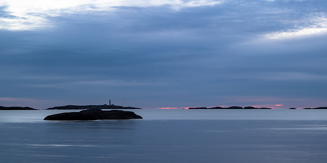
Early dawn at Skagerak, Southern Norway
Early dawn at Skagerak, Southern Norway
Large, 'wall-to-wall' images seem to be quite popular in website building. But a large, maybe over 2000px wide image is quite a heavy load on a small phone internet connection, therefore the best practice is to have the same image in various sizes, and let the screen size decide, which one to load. This is called a 'source set'.
The image on this page is such a source set. It contains three sizes of the image, and I have used Photoshop to resize the image to the default Foundation breakpoint positions and called them 'dawn-640', 'dawn-1024' and then just 'dawn'. Three different sizes should be enough, but you can create more or less, just add a breakpoint where you want to use them. If you are working in Bootstrap, you may want to have 4 different image sizes, for the breakpoints at 576px, 768px, 992px and 1200px.
You are not dependent on Foundation, this can also be done in Bootstrap (the images sizes may vary, though) or any other grid system. And you need an image editing programme, you are not limited to just Photoshop.
This is just a 'how-to', but if you want to make a Foundation component of the image source set system, just select the container 'img-wrapper'.