So what is this?
Tabs can have many functions. They can be used as navigation, where the 'pages', or panels rather, open below the tab buttons. Those panels can cover a whole page, or just part of a page, depending on the contents. Open the other menu items to get some ideas about what can be put into a pane. Actually, only your imagination sets the limitation to what content you may fill them with. There will be a scroll bar appearing on the right if you have more contents than can be displayed all at once.
To make more or less 'menu items', you have to duplicate or delete a button and the corresponding 'tabcontent' container. When creating new ones they have to be tied together with a unique ID for the 'tabcontent', and an attribute linking the button to the right 'tabcontent' ID. To make a component, you need to select the container 'tabs-wrapper'. Be aware of the wee bit of js in the footer section.
Close
An image gallery
Close
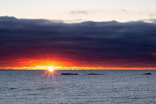
Early sunrise
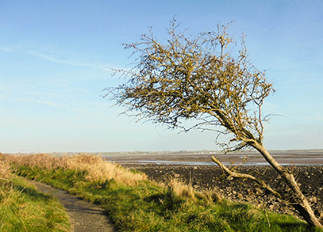
No doubt about the main wind direction
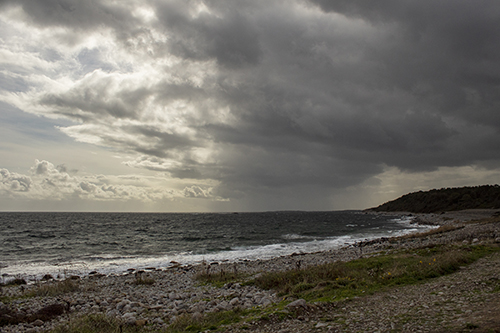
Bad weather coming in

After a snow fall

The 'golden' hour
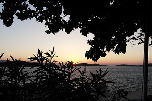
Sunset

After sunset
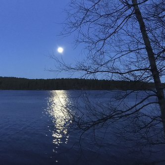
April full moon
A table
Instructions for creating and tweaking the table van be found here: http://eikweb.com/sharing/table/index.html
Close
Cards with an out-of view feature
The actual cards are placed further down the page, otherwise the out-of-view state would not work. If the page with this feature is opened just by clicking a link, you will see the images 'growing'. When placed in a tab panel, like here, you need to have some page contents above it, so that the cards are invisible when opening the page. In this case I have just put some space and some filling text in. I have explained the out-of-view state and how to create it in its own building block, check
http://eikweb.com/sharing/four-up/index.html
Lorem ipsum dolor sit amet, consectetur adipiscing elit. Integer nec odio. Praesent libero. Sed cursus ante dapibus diam. Sed nisi. Nulla quis sem at nibh elementum imperdiet. Duis sagittis ipsum. Praesent mauris. Fusce nec tellus sed augue semper porta. Mauris massa. Vestibulum lacinia arcu eget nulla. Class aptent taciti sociosqu ad litora torquent per conubia nostra, per inceptos himenaeos.
Scroll down, scroll down to find the cards...
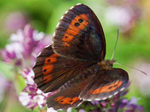
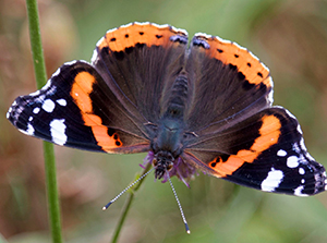
Butterfly 1
Lorem ipsum dolor sit amet, consectetur adipiscing elit. Maecenas et metus.
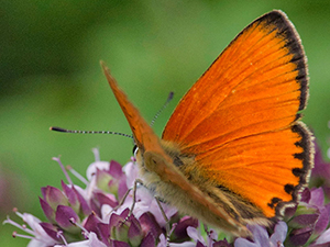
Butterfly 2
Lorem ipsum dolor sit amet, consectetur adipiscing elit. Maecenas et metus.
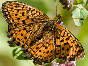
Butterfly 3
Lorem ipsum dolor sit amet, consectetur adipiscing elit. Maecenas et metus.
Butterfly 4
Lorem ipsum dolor sit amet, consectetur adipiscing elit. Maecenas et metus.
Close