Horizontal cards, Foundation

Heading Level 4
Lorem ipsum dolor sit amet, consectetur adipiscing elit. Maecenas et metus.

Heading Level 4
Lorem ipsum dolor sit amet, consectetur adipiscing elit. Maecenas et metus.

Heading Level 4
Lorem ipsum dolor sit amet, consectetur adipiscing elit. Maecenas et metus.

Heading Level 4
Lorem ipsum dolor sit amet, consectetur adipiscing elit. Maecenas et metus.
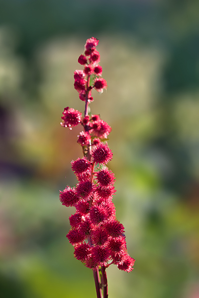
I did not use the Foundation class 'card' here, because it seems to be styled for vertical cards. Instead I gave them the class name 'horizontal-card'. The only Foundation class that I have used, is the 'thumbnail' for the images. That gives them the wee white border. The width for image and text can be changed to your liking, I opted for 40/60.
To make a component of just one card, select the horizontal-card container, that is, one of them. All four cards are sitting in a container 'card-wrapper'. You can add as many cards as you like.